Bluelib Example
Panels
Panel
A panel is a base container styled with a slight background color and no borders.
Box
A box panel is a generic container styled as a box with borders on all four sides.
Dialog
A dialog panel is a container for quotes or dialogues, styled as a box with only the left border.
Parenthesis
A parenthesis panel is a container for text tangentially related to the rest of the document, styled as a box with smaller text and no borders.
Dimensions
Panels always have a 8px margin and 8px of padding.
Hi! This is me talking to you, the reader!
I'm testing panel dimensions!
See? The margin between these dialog panels is consistent!
Nesting
Panels of any kind can be infinitely nested.
Like this!
How deep does this rabbit hole go?
BWOON.
BWOON.
BWOON.
Chapters
Chapter
A chapter is a grouping of an heading and multiple panels containing tightly related information.
You're seeing one right now!
Panel heights
In a chapter, all panels on a row inherit the height of the tallest panel in it, so that no empty space is left.
Auto-wrapping
Additionaly, panels in a chapter will automatically wrap if their contents won't fit horizontally.
Force-wrapping
You can override the automatic wrapping and manually decide where a chapter should wrap by inserting a force-wrap element where you want the chapter to wrap.
16px vertical margin when a chapter is force-wrapped.
Separators
Separator
A separator is a horizontal line that fills all the horizontal space available on a panel, forcing a line wrap.
Top Text
Light separator
A light separator is a slightly more transparent separator, to be used if the regular color distracts too much from the flow of the text.
Bottom Text
Heavy separator
A heavy separator is a non-transparent separator, to be used if the regular color isn't apparent enough.
Bottom Text 2: Electric Boogaloo
Images
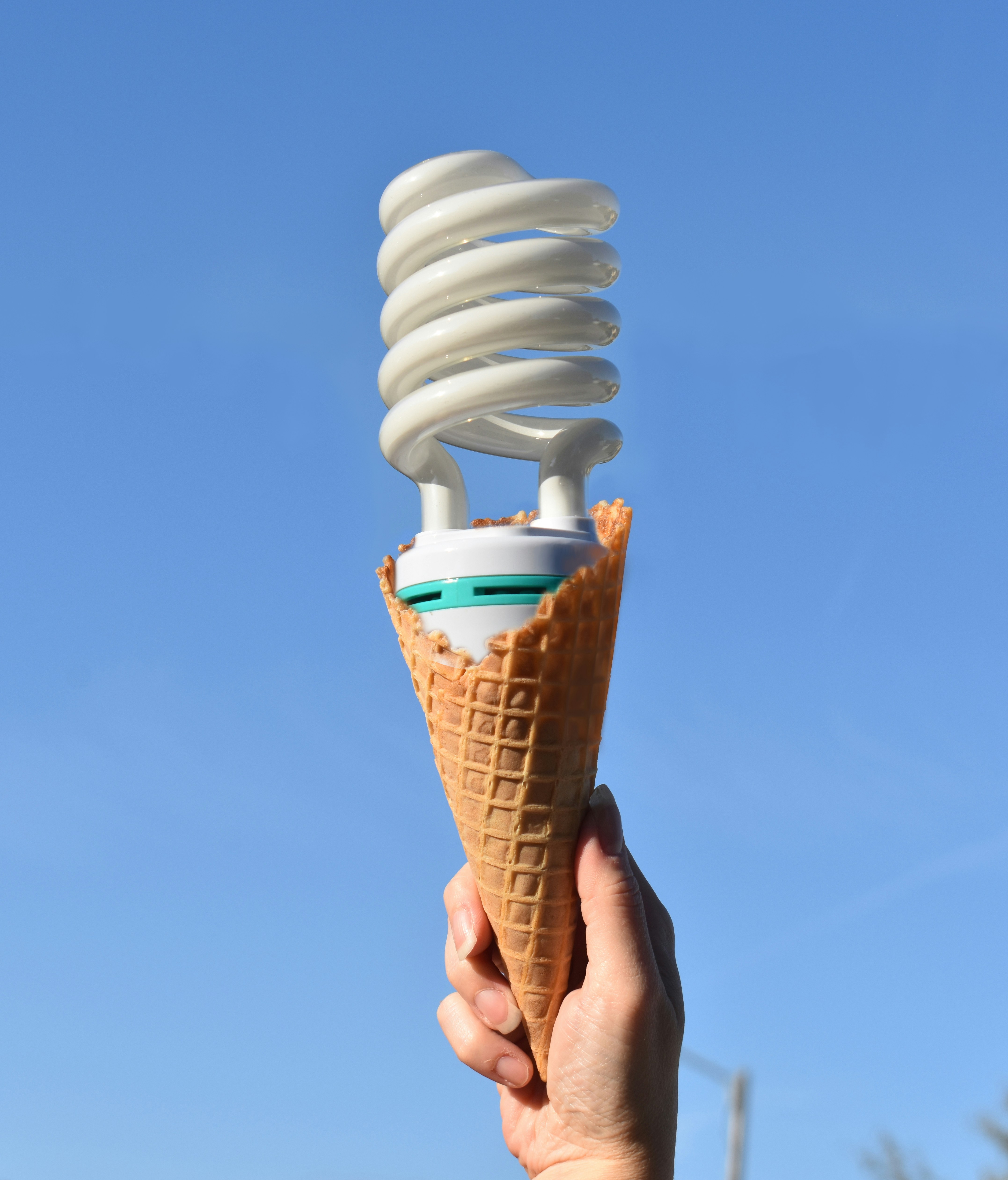
Default
Images are automatically centered and resized to fit the panel they are in.
Limited
Images can be limited to prevent them from taking up too much screen space.
Half
The following image has a limit of half the vertical viewport:
Quarter
The following image has a limit of a quarter of the vertical viewport:
Figures
Images can be wrapped in a figure element to semantically provide additional detail to them.
Tables
Table
A table is an element displaying data aligned and ordered by rows and columns.
| Mario | Luigi | |
|---|---|---|
| Tables | They're cool and allow you to do cool stuff | They need chairs to be useful |
| Flexboxes | They're very useful | Not enough flexible for me |
| Grids | I love them | Bleargh |
| Overall | <3 | 0/10 |
Elements in tables can be marked to increase their contrast with the rest.
| O | X | |
| X | X | O |
| X | O |
Captions can are above the table by default, but they can be moved below the table.
| S | <span> |
|---|---|
| A | <a> |
| B | <body> |
| C | <caption> |
Lists
Unordered lists
An unordered list displays a series of items whose order is irrelevant.
- This
- That
- Wooper
- Quagsire
Ordered lists
A ordered list displays a series of items whose order is relevant.
- Gold
- Silver
- Bronze
- Iron
Description lists
A description list displays a series of name-description pairs.
- Key
- Value
- Other key
- Other value
Status
Disabled
An element can be disabled to make it partially transparent, non-interactable and displaying the not-allowed cursor when hovered.
Any element, from a <span> to a chapter, can be disabled.
Inputs
Input
An input is an interactive element that allows the reader of the page to interact with it.
They come in multiple kinds:
Field
A field is an input where the user can insert text with their keyboard.
Select
A select is an input where the user can select one between multiple options.
Area
A area is a resizable input where the user can insert multiple lines of text with their keyboard.
Multiselect
A multiselect is an input where the user can select many options from a list.
Radio
A radio is an input which the user can either select or not, deselecting the other radios with the same name.
Checkbox
A checkbox is an input which the user can either select or not.
Button
A button is an input which the user can interact with to trigger a reaction.
Forms
Forms, labels and inputs
A form is a grouping of labels and inputs with the same purpose, with the former describing what should be entered in the latter.
Form groups
Inputs such as radios or checkboxes should be grouped together when inserted in a form.
Groups automatically wrap if the inputs don't fit on a single line.
Row groups
A row group is a form group where the inputs are arranged vertically instead of horizontally.
Form rows
Forms can also contain form rows, elements which ignore the form columns and instead take up the whole row.
Common elements
Headings
An heading is the title of an article, chapter or panel.
Level-1
Level-2
Level-3
Level-4
Level-5
Level-6
Generally, panels look nicer if they start with a level-3 heading, but you may use whichever you want, as Bluelib will automatically handle the margin.
Anchors
An anchor is a part of text which can be clicked to move to a different page or part of page.
Visited anchors have a slightly different color.
Anchors with no destination are colored differently, so that the page author can notice and fix them.
Anchors which start a download or open an external program have also have slightly different color.
Details and summaries
A detail is an element which collapses the elements inside until its summary is clicked.
There's something inside here...
Multiple can be displayed aside each other, and can also be nested.
There's something else inside...
There's another item...
Recursion
Recursion
Recursion
Recursion
Annotations
Ruby text
A ruby is an inline element with annotations above the text.
Mo de na
漢 字
明日
Todo
A todo is a panel marked as incomplete by the page author.
Its colors are palette-independent and derive from the 🚧 Twemoji.
Semantics
Semantics
A semantic is an inline element having a specific meaning defined by the HTML specification.
Here's the full list of them:
- Abbreviation
- Bring Attention
- Citation
-
Code with variable - Definition
- Emphasis
- Idiomatic Text
- Mark Text
-
Inline Quotation
-
Strikethrough - Sample Output
- Side Comment
- Strong Importance
- Unarticulated Annotation
- Variable
Keyboard
A keyboard element represents an interaction of the user with any kind of interface, such as a keyboard key like Enter, a combination of key presses like Ctrl + Alt + Del, or the interaction with an UI element like the Refresh button.
Key presses and releases can be distinguished via special classes: Press A Release A
Preformatted and code
A preformatted text element displays its content as it is, preserving all spaces, newlines, and indentation.
This is regular preformatted text. :)
If code is being represented, it should be wrapped inside a code element.
This is preformatted code text. :)Colors
Bluelib color
All Bluelib elements get their Bluelib color dynamically from the --bluelib-color-* CSS variables, and then use it to paint themselves.
It is possible to change this color to alter the color of not only text, but panels and other elements as well!
Red
This is a red box.
Orange
This is an orange box.
Yellow
This is a yellow box.
Lime
This is a lime box.
Cyan
This is a cyan box.
Blue
This is a blue box.
Magenta
This is a magenta box.
Gray
This is a gray box.
White
This box has a custom color: it is always white!
Black
This box has a custom color: it is always black!